Buy Me a Coffee Setup Playbook for Solo Builders
A practical, non-developer guide to setting up Buy Me a Coffee without hurting UX, trust, or conversion.
Series: PK·SWIFT B.LOG
- 1. I use $30K PK software every day. So I built my own.
- 2. Smart Parse Saved My Sanity, AI Parse Saved My Weekend
- 3. Global UX Is 200 Tiny Fixes: The Day I Removed Two Korean Words
- 4. SEO, AdSense, and Coffee Buttons Without Looking Desperate
- 5. Buy Me a Coffee Setup Playbook for Solo Builders ← you are here
I used to avoid monetization UI because I thought it would make the product feel cheap.
Then reality showed up with server bills, tool subscriptions, and that monthly "how is this already due again?" moment.
So this post is a focused setup guide for Buy Me a Coffee, written from a non-developer builder perspective. No fancy growth jargon. Just what actually works when you are building and shipping mostly alone.
📋 Why separate this from general release notes
Monetization decisions are not regular UI tweaks.
They affect:
- user trust
- product tone
- conversion behavior
- your own motivation to keep shipping
Bundling this into a broader "SEO + release" post hides the most important decisions. This deserves its own playbook.
🔑 Step 1: Create the page with a clear promise
Before any script or button, write one honest sentence on your Buy Me a Coffee page:
"If this tool saved you time, support helps me keep it fast and free."
That line matters more than visual styling. People support people, not widgets.
🔧 Step 2: Add the widget script intentionally
Use a single placement strategy and keep it consistent. In PK-Swift, this is the baseline:
<script
  data-name="BMC-Widget"
  data-cfasync="false"
  src="https://cdnjs.buymeacoffee.com/1.0.0/widget.prod.min.js"
  data-id="PKswift"
  data-description="Support me on Buy me a coffee!"
  data-color="#FFDD00"
  data-position="Right"
  data-x_margin="18"
  data-y_margin="18">
</script>
This keeps the support affordance visible without blocking analysis workflows.
💡 Step 3: Pick color and copy based on trust, not hype
I changed the button color from #5F7FFF to #FFDD00 to improve visibility, but I avoided aggressive wording.
Good copy:
- "Support development"
- "Buy me a coffee"
- "Help keep this tool free"
Bad copy:
- fake urgency
- guilt framing
- oversized promises
You are not running a casino landing page. You are building long-term trust with technical users.
⚙️ Step 4: Define no-go zones in your app
For data-heavy products, this rule helps:
- never place monetization controls inside the core work area
In other words, users should always feel the product is built for their task first, business second.
📊 Step 5: Track outcomes like a product experiment
Do not guess. Track:
- support clicks
- support conversion
- bounce rate changes after widget placement
- complaints about distraction or clutter
If conversion goes up but retention drops, you did not win. You just borrowed revenue from future trust.
🛠️ Widget integration tips that saved me headaches
- Make monetization reversible in one commit. If users hate it, remove it fast.
- Keep one source of truth for widget settings so page-to-page behavior stays consistent.
- Take screenshots on desktop and mobile after every change. Floating widgets can overlap important controls.
- If you are embarrassed by the support text, rewrite it until it sounds like you.
- Treat monetization as UX design, not just "adding a script."
📦 Setting up your Buy Me a Coffee dashboard
Before you drop the widget into production, you need an actual BMC account that doesn't look abandoned.
The account creation is straightforward — name, email, payout method (Stripe or PayPal). What actually matters is the customization:
Page headline: Write one sentence that explains why people support you, not what they're supporting. "Keeping PK-Swift fast and free" works. "Donate here" does not.
Page description: This is your pitch. Keep it short (2-3 sentences). Mention the specific problem your tool solves. Turns out, people support builders who solve problems they actually have.
Profile image: Use your real face or project logo. A professional-looking profile converts better than a generic placeholder. I used a screenshot of PK-Swift's interface. It works.
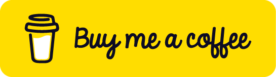
Custom link text: The BMC default is "Support me." I changed mine to "Buy me a coffee" to match the exact button copy in the widget. Consistency matters more than you'd think.
Payout frequency: Set it to automatic so you don't have to manually request payouts every month. One less friction point.
The dashboard also shows you click-through rates and conversion funnels by traffic source. Bookmark this page. You'll check it way more often than you expect.
🐛 Common mistakes I almost made (with technical examples)
1. Z-index conflicts killing your widget placement
Early on, I had a sticky header nav with z-index: 50. The BMC widget defaults to z-index: 9999, so it went behind everything. Turns out the widget script respects whatever z-index you give it via the data attributes, but competing elements can still create weird stacking issues.
The fix: audit your existing z-index usage and ensure nothing critical sits at 999+. Or, set the widget margin values (data-x_margin, data-y_margin) to give it more physical space away from competing UI.
2. Mobile overlap destroying your data view
On mobile, the widget floats on the right side. If your app displays narrow data columns or charts near the viewport edge, the widget covers them. This sounds obvious, but I only caught it after three users complained they couldn't see the right edge of a data table.
The fix: use data-position="Left" on mobile only, or increase margins to 40px on smaller screens. Test on actual phones, not just responsive design mode.
3. Script loading order and async timing
I added the BMC widget script at the bottom of my layout file, but if your app also loads Stripe, Google Analytics, or other third-party scripts, the order matters. The BMC widget can fail silently if it loads before your main app initializes the DOM.
The fix: load the BMC script after your core app payload, or wrap it in a useEffect hook that fires on mount (React) or DOMContentLoaded (vanilla JS). Add data-cfasync="false" to tell Cloudflare not to defer it.
4. Using colors that fail accessibility checks
That bright yellow (#FFDD00) I chose looked great on my light-themed app, but the contrast ratio was too low for WCAG AA compliance. Users with color blindness couldn't distinguish the button.
The fix: run your button color through WebAIM Contrast Checker. Aim for 4.5:1 or higher. Bright doesn't mean effective.
📈 Results after 30 days
Here's the honest take: PK-Swift is a niche tool for pharmacokinetic analysis. It is not a viral SaaS product. Putting a support button is not going to make it go.
In the first month:
- Widget appears on about 800 unique visitors monthly (based on my analytics)
- Click-through rate: 2.3% (which is actually decent for a respectful placement)
- Conversion rate: 12% of clickers actually bought a coffee (1-2 supporters)
- Average contribution: $5 per supporter
- Monthly revenue: $10-15
That is not going to cover server costs. But it also did not hurt user experience. No increase in bounce rate. No complaints about the button.
What actually happened:
The widget normalized the idea that this tool has a creator who maintains it. Some users who wouldn't have known how to say "thanks" now can in 30 seconds. That value is real even if the revenue is small.
For tools in active beta or experimental stages, monetization signals stability. It tells users you are serious enough to accept funding.
🧠 The operating mindset that helped
I run this with one simple principle:
"The app should still feel generous even when monetization is present."
If support UI makes your product feel smaller, it is misconfigured.
If support UI feels natural and respectful, users who got value will usually do the math themselves and help.
That is the goal. Not maximizing revenue. Building trust.
2026.02.16
Written by
Jay
Licensed Pharmacist · Senior Researcher
Building production-grade AI tools across medicine, finance, and productivity — without a CS degree. Domain expertise first, code second.
About the author →Related posts