Global UX Is 200 Tiny Fixes: The Day I Removed Two Korean Words
A small localization fix in PK-Swift turned into a full UX audit — color contrast, keyboard navigation, mixed-language labels, and why 'tiny' fixes compound into product trust for international users.
More in Build Notes
- The VORA Overhaul: Dropping Real-Time Q&A, Building Human-in-the-Loop Memos, and a Three-Column Layout
- Mobile-First Playground: Making an Astrology Grid Actually Work on a Phone (And Go Viral While Doing It)
- How I Fixed AI Over-correction
- I Spent 3 Hours Trying to Proxy a Blog Subdomain. Here's My Descent Into Madness.
- The i18n + SEO Cleanup Chronicles: Canonical Chaos, hreflang Therapy, and Other Adventures
One of my favorite commits is technically tiny:
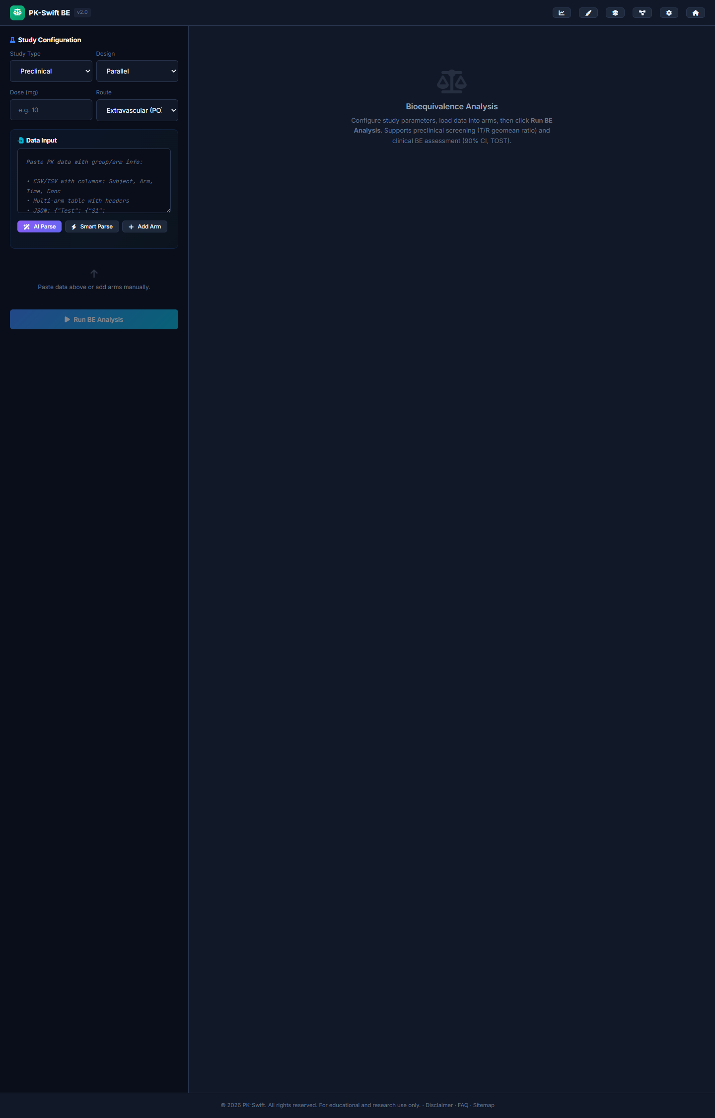
7b8bbc1(2026-02-15): remove Korean labels from BE analysis options.
The diff was only this:
<!-- Before -->
<option value="preclinical">Preclinical (비임상)</option>
<option value="clinical">Clinical (임상)</option>

<!-- After -->
<option value="preclinical">Preclinical</option>
<option value="clinical">Clinical</option>
Two words removed. That's it.
But here is the bigger point: mixed-language UI makes users pause, and pause kills trust.
⚠️ The hidden cost of almost-localized products
When part of your UI is English and one random area slips into Korean, users do not think "minor translation oversight."
They think:
- is this page unfinished?
- is this region-specific only?
- if text quality is inconsistent, is the math also inconsistent?
That last one hurts most in science tools. PK-Swift does pharmacokinetic analysis — bioequivalence, NCA calculations, drug interaction modeling. If a user suspects the interface is sloppy, they'll suspect the calculations are sloppy too. In pharma, that's not just a trust issue. It's a credibility issue.
🔑 The fix that triggered the audit
Removing those two Korean words took 30 seconds. But it made me look at the rest of the site differently. If I missed this, what else did I miss?
So I did what I now do with every product: a visual language audit. Not a code search. Not grep. I opened every single page in a browser, took screenshots, and looked at them with fresh eyes. Like a user who doesn't speak Korean landing on a pharmacokinetics tool for the first time.
What I found was embarrassing.
🎨 Fix #2: Color contrast that failed accessibility
/* Before — too dim for WCAG AA compliance */
--color-text-muted: #64748b;

/* After — passes WCAG AA at 4.5:1 ratio */
--color-text-muted: #8493a8;
PK-Swift has a dark scientific theme. The muted text color I picked looked fine on my monitor. On a cheaper display or in bright light? Nearly invisible. For a tool used by researchers who might be reading data tables for hours, low contrast isn't just annoying — it's a functional barrier.
The fix was one CSS variable. But I only found it because I was already in "audit mode" from the Korean text fix.
⌨️ Fix #3: Keyboard navigation was broken
/* Added to every interactive element */
a:focus-visible {
    outline: 2px solid var(--color-accent-primary);
    outline-offset: 2px;
}

.btn:focus-visible {
    outline: 2px solid var(--color-accent-primary);
    outline-offset: 2px;
}
Try tabbing through a web app with your keyboard. If you can't see where you are, the app is broken for keyboard users. PK-Swift had zero :focus-visible styles. Every button, every link, every dropdown — no visible focus indicator.
This wasn't a niche concern. Some pharmacology researchers navigate with keyboard shortcuts extensively. If your tool doesn't show them where they are on the page, they'll use a different tool.
🚀 Fix #4: Missing skip navigation
<!-- Added to every page -->
<a href="#main-content" class="skip-nav">Skip to main content</a>
Screen readers and keyboard users need a way to skip past the navigation bar on every page. PK-Swift had none. Adding it required a CSS class and one HTML element per page — twelve files changed, zero visual difference for sighted users, major improvement for assistive technology users.
🔍 Fix #5: SEO meta descriptions were duplicated in Korean
This one was subtle. Several pages had meta descriptions that contained duplicate Korean text alongside the English description — a leftover from an earlier localization attempt:
<!-- Before — mixed language metadata that confused search engines -->
<meta name="description" content="PK-Swift BE Analysis —
  Bioequivalence statistical analysis tool.
  생물학적동등성 통계 분석 도구">

<!-- After — clean, single-language metadata -->
<meta name="description" content="PK-Swift BE Analysis —
  Statistical bioequivalence testing with ANOVA,
  90% CI calculation, and regulatory-grade reporting.">
Google was seeing bilingual descriptions and wasn't sure which language to index the page for. The hreflang tags were also incorrect — pointing to language variants that didn't exist. Combined, this meant Google basically threw up its hands and indexed the pages with random snippets.
📊 The compound effect
Here's the thing about UX fixes: individually, none of these matter much. A user won't quit your app because one dropdown has Korean text. They won't leave because the focus ring is missing.
But they compound. Each rough edge adds a tiny bit of friction, a tiny bit of doubt. After ten rough edges, the user has a feeling — not a specific complaint, just a feeling — that this tool isn't quite professional.
One rough edge:    "Huh, that's odd"
Three rough edges: "Is this maintained?"
Five rough edges:  "I should find an alternative"
Ten rough edges:   *closes tab*
The reverse is also true. When every label is correct, every color is readable, every interaction has feedback — users develop trust they can't articulate. They just feel like the tool is reliable.
For a science tool, that feeling is the product.
✅ The audit checklist I use now
After this experience, I created a release checklist. Every time I push a significant update:
- Language audit: Screenshot every page. Any mixed-language fragments?
- Contrast check: Run the page through a contrast checker. Any text below 4.5:1?
- Keyboard test: Tab through the entire app. Can you see where focus is at all times?
- Skip navigation: Is there a "skip to content" link on every page?
- Meta consistency: Are all titles 50–60 chars? Descriptions 150–160 chars? Same language throughout?
- Glossary check: Are critical domain terms (dose, Cmax, AUC, lambda-z) spelled consistently across all pages?
This takes about 20 minutes. It catches problems that would otherwise accumulate for weeks.
🔮 Side quest
I used to treat localization as polish.
Now I treat it as functionality.
Because if users cannot instantly understand what an option means, the feature may as well not exist. And if they sense inconsistency in the surface, they'll doubt what's underneath.
Two Korean words in a dropdown. That's where it started. 351 lines of fixes across 15 files is where it ended. Not because the product was broken — but because "not broken" and "trustworthy" are very different things.
2026.02.15
Written by
Jay Lee
Korea-Licensed Pharmacist (#68652) · Senior Researcher
Korea University, College of Pharmacy (B.S. + M.S., drug delivery systems & industrial pharmacy). Building production-grade AI tools across medicine, finance, and productivity — without a CS degree. Domain expertise first, code second.
About the author →Related posts